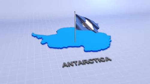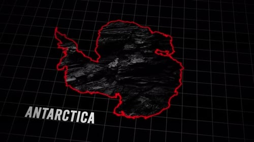
Antarctica Decline Data Visualization with Bar Graph Animation
By moononOne great value subscription from $16.50/month
- Unlimited downloads of 27+ million creative assets
- AI Tools: video, image and more
- Lifetime commercial license
- Easy cancellation
Already have an account? Sign in
Attributes
- Length
- 0:11
- Resolution
- 1920 x 1080
- File Size
- 513 MB
- Frame Rate
- 29.97 fps
- Alpha Channel
- No
- Looped
- No
- Video Encoding
- ProRes
- Orientation
- Horizontal
- Commercial License
- Further Information
Description
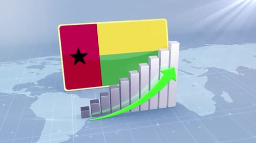
This animated visual presents a 3D bar graph illustrating a significant downward trend, marked by a prominent red arrow cascading from left to right. Set against a serene light blue backdrop featuring a world map grid and a stylized map of Antarctica, the clean and modern design is ideal for corporate presentations, scientific reports, or educational content. The decreasing data visualization effectively conveys falling statistics, environmental concerns, or economic recession in a clear and engaging manner, particularly relevant for topics concerning polar regions or global changes. The sleek animation provides a professional and impactful way to communicate complex information.